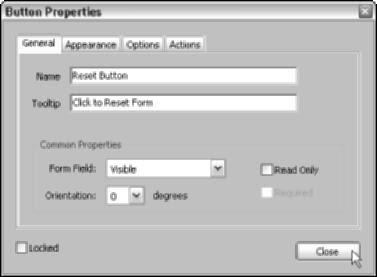
The options on the General tab are applicable to every field type and are used to specify the identity of the field and select common display and function properties. General tab of the Button Properties dialog box shows the same options you find on the General tab regardless of which field type properties dialog box is opened. Note that after selecting General options (or any other field option for that matter), you must click Close to close the Field Properties dialog box, and then click the Hand tool on the Basic Tools toolbar or press H in order to view your changes.
The following list describes the options found in the labeled areas of the General tab:
- Name: Enter a descriptive name for a form field in this text box. When you create a form field, it is given an incremental default name, such as Button1, Button2, and so on.
- ToolTip: Enter a descriptive name or short instruction in this text box; this text appears as a ToolTip when the user hovers the mouse pointer over the form field element.
- Common Properties: These miscellaneous options apply to all field types. Select the Read Only check box to specify text fields that cannot be modified by a user. Select the Required check box to specify that a field must be filled in before form data can be submitted.
Use the Form Field drop-down list to select whether a field is Visible, Hidden, Visible but Doesn’t Print, or Hidden but Printable. The Orientation drop-down list lets you choose the text orientation in 90-degree increments for text that is either entered in a text field, selected in a combo or list box, or used as a button label. The Orientation option also applies to graphic icons used as button labels. To restrict any future changes to the selected form field, select the Locked check box in the lower left corner of the General tab.

 The options on the Appearance tab are applicable to every field type and are used to specify the way a field is displayed in a PDF form. Note that to apply appearance options (or any other field option for that matter) to a selected form field, you first click Close to close the Properties dialog box, and then click the Hand tool on the Basic Tools toolbar or press H in order to view your changes. The following list describes the options found in the labeled areas of the Appearance tab that you can use to change the way a form field is displayed in a PDF form:


